UTEP
ACADEMIC PROGRAMS
Transforming University Program Discovery
Prospective Students
Discovering possibilities.

Academic Programs
Accessible to Everyone.
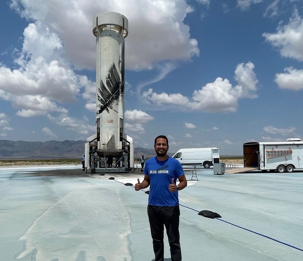
Alumni Stories
Real Stories, Real Success.

Inspiration
For an Incredible Life and Career
New UTEP Academic Programs Platform
Built UTEP's academic program discovery experience to help prospective students make informed career decisions. Through user research, design, and web development, created flexible templates that achieved a 4% conversion rate while empowering content managers with no-code publishing workflows. And connecting prospective students to enrollment services throug our CRM.
The Problem
There was no tool specifically designed to inform and guide our primary audience, prospective students. The closest tool, the academic catalog, was packed with technical information. While it worked fine for current students planning their schedules, it didn't help prospective students understand:
- What each program was actually about
- What career opportunities they could pursue
- Learn success stories from graduates
- How programs matched their interests and goals
The design was also outdated and not engaging - no personalized content, compelling images, or videos that would excite potential students about their future.
“This is a very detailed map, but I don't know the destination.”
— Ana, Prospective Student
From a business perspective:
- There was no platform to run digital campaigns and track performance
- We were not connecting with our primary audience
- We were not integrating interested prospective students to a pre-enrollment process to inform and guide them
- We were not capturing data to get to know our primary audience
- We didn't have a baseline of enrollment data that we could latter on optimize
- Content managers found it difficult to update web content, leading to outdated content
Primary Audience, Team & Stakeholders
Stakeholders
- Office of Admissions & Recruitment
- Extended University
- Enrollment Systems
- Content Managers
- College of Education
- College of Engineering
- College of Health Sciences
- College of Liberal Arts
- College of Nursing
- College of Science
- School of Pharmacy
- Woody L. Hunt College of Business
- Graduate School
Project Team
- UX Designer
- Marketing Data Analyst
- UI Developer
- Project Manager
- Creative (Photo & Video)
- Editorial
Roles performed by me.
Research, Design & Code
The Research
To understand how students research university programs and application information, we interviewed high school seniors and first-year college students. Our research uncovered several key pain points:
- Lack of a Clear Process: There was no single, defined pathway for users to research academic programs, forcing them to navigate a fragmented landscape of information.
- Scattered Information: Students relied on Google, leading them to a scattered collection of data rather than a unified source.
- Incomplete Tools: The course catalog, while descriptive of individual courses, was the closest available resource. However, it lacked crucial information such as career opportunities, success stories, and the ability to connect with the university.
“Not inspiring for a life-changing decision.”
— Ruben, Prospective Student
Besides our primary audience, we also solicited requirements internally:
- Interviewed CRM owners to understand requirements for integrating forms and capturing necessary information
- Interviewed Leadership and Staff from enrollment services to understand their requirements
- Conducted competitive analysis using examples from other universities provided by leadership
Key Discovery
Prospective students need more than just a course catalog. They require inspirational, outcome-focused content to make informed decisions about their academic future. Our in-depth user interviews revealed that prospective students want to understand:
- Career opportunities and earning potential
- Alumni success stories and outcomes
- Program differentiation and unique value propositions
- Clear pathways from interests to career goals
The Design
Sitemap
The solution centered on creating three distinct program pathways (Undergraduate, Graduate, Online) with personalized content architecture and streamlined content management workflows.
Wireframes V1
✅ Our initial wireframes (V1) incorporated the content that prospective students, our primary audience, were looking for. The user journey was a simple, consisting of an index page with modal overlays for specific programs.
❌ However, while this design was simple to build, it lacked the emotional connection needed to engage users. The wireframes were too text-heavy and didn't offer the personalized content that prospective students need to connect with the university.
Wireframes V2
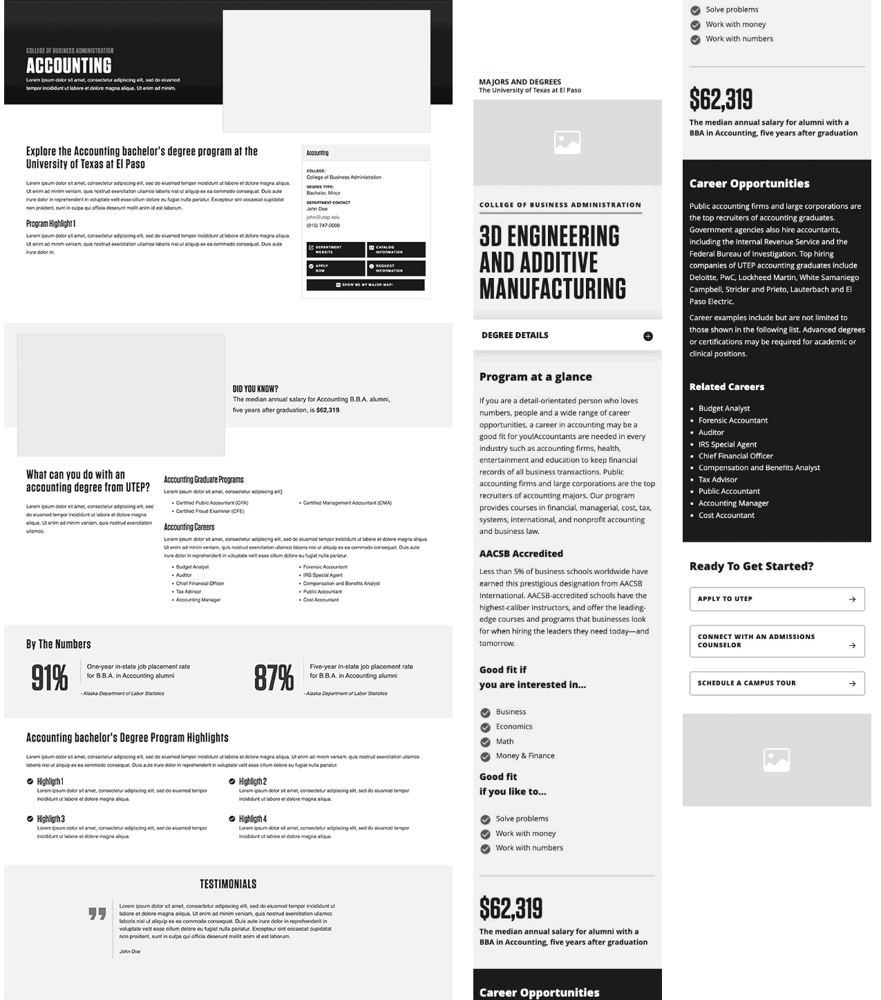
✅ Based on our research, Wireframes V2 was more aligned with what prospective students wanted. We enriched the pages with photography, video, highlights, testimonials, and key facts about each program.
❌ However, the design had a significant flaw. The first section of the page included multiple links to external resources like the academic department, catalog, and application pages. These links had the same visual hierarchy as our primary business objective for the page: the “Request Information” form. This created a lack of focus and potentially drew users away from our main call to action.
Wireframes V3
✅ This version of the wireframes was meticulously refined, with every element serving a specific purpose. We removed unnecessary and distracting links, ensuring the design stayed focused on the needs of our primary audience and our core business objective.
✅ Using an adaptive design approach, we avoided creating overly long pages, a crucial decision since our CRM form was strategically placed at the bottom. A/B testing confirmed that this placement significantly improved conversion rates.
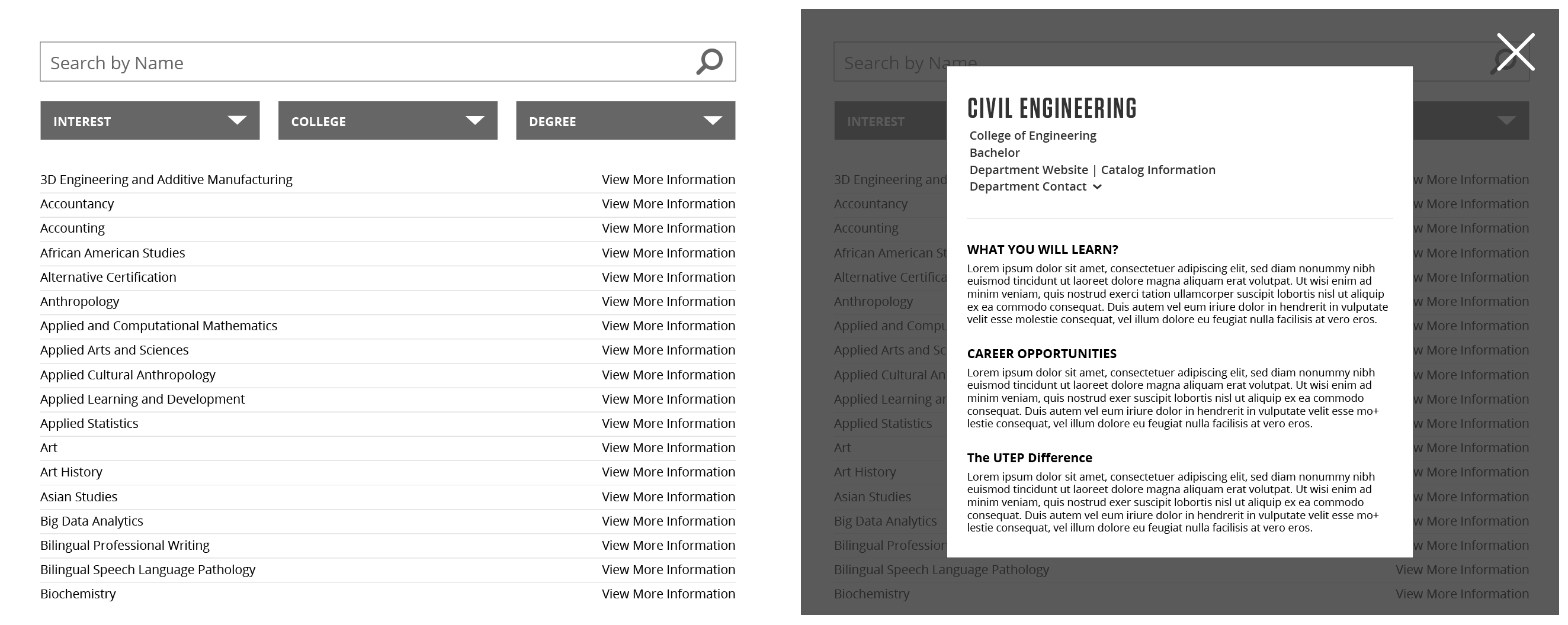
Index Page Prototype
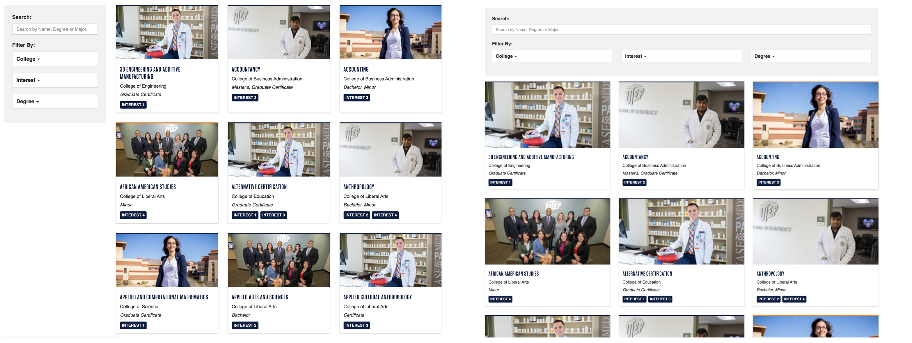
Sidebar vs Top bar: We built a prototype to test the placement of filters and found that a sidebar is more usable for desktop users, while a top bar works better for mobile. On mobile, the filters are kept out of sight within a dropdown menu, making them visible only when a user needs them.
Filters State Persistence: Usability tests revealed that users expect their selected filters to persist when they navigate away from a program page and then return. This feature prevents users from having to re-select their preferences, creating a smoother user experience.
Autogenerated Content: To streamline content creation and simplify future maintenance, our index pages will be autogenerated. By pulling content directly from the program pages, we eliminate the need for manual updates and ensure information stays consistent across the site.
We used no code tools (Webflow) for fast protoyping, here is the link to the Index Page Prototype:Webflow Prototype
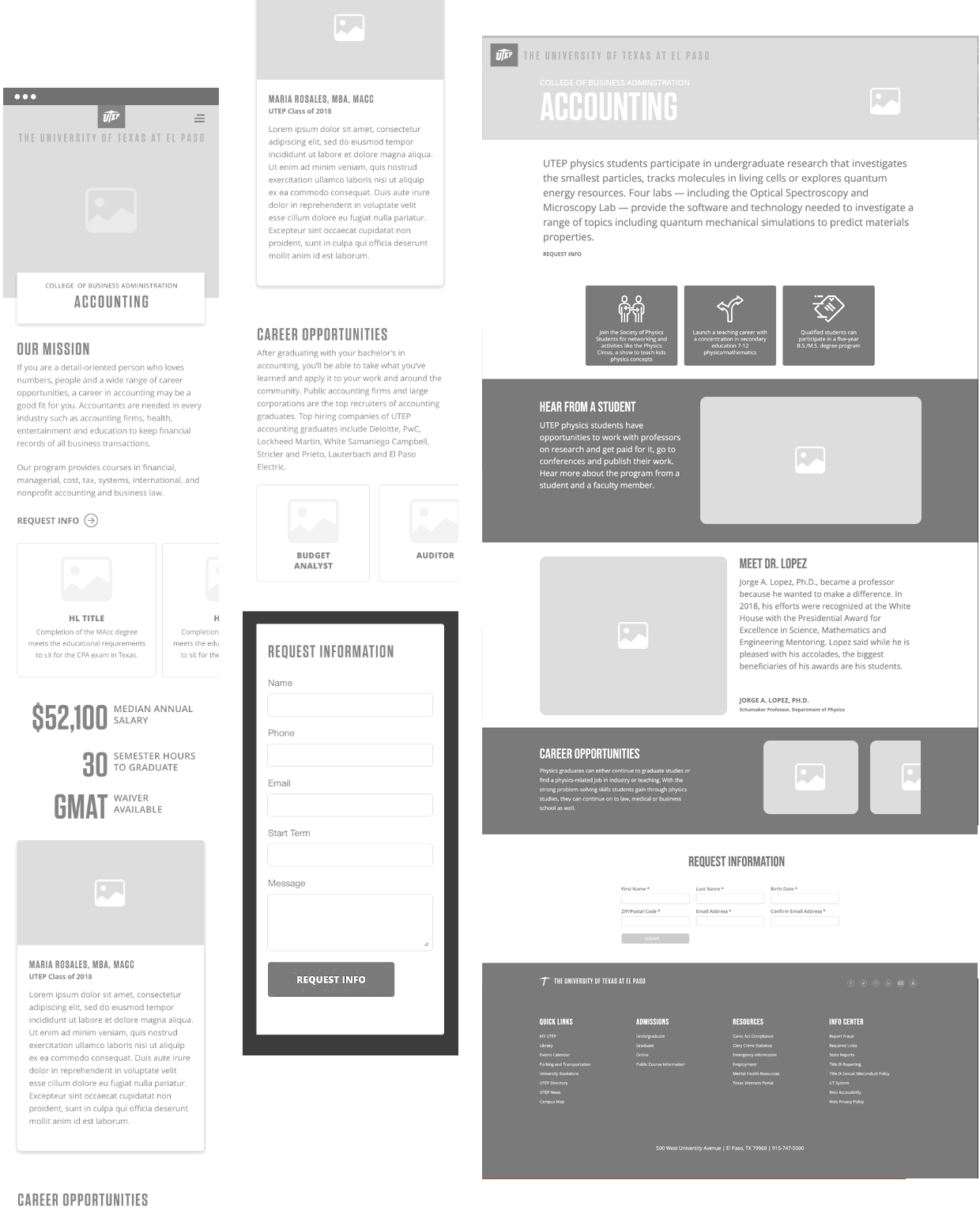
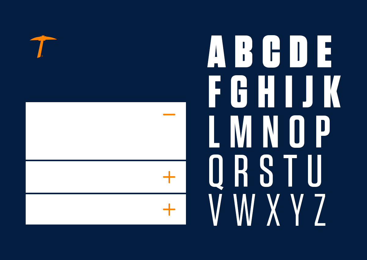
Visual Design

Primary Lockup
Primary Color
#041e42
Accent Color
#ff8200
Neutral Color
#1a1b1f

Primary Typeface
Tungsten Bold - Headings

Secondary Typeface
Open Sans Regular - Body
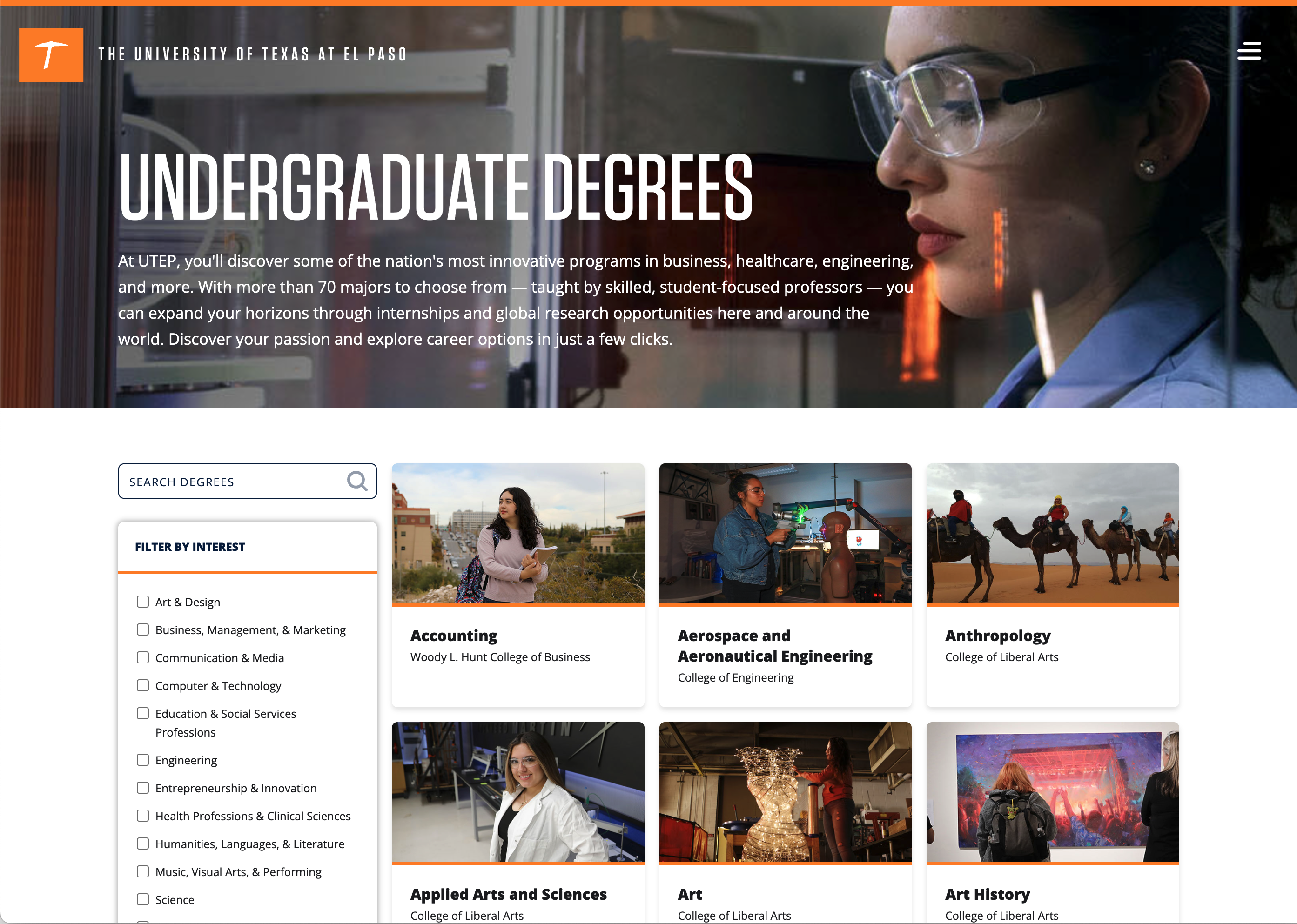
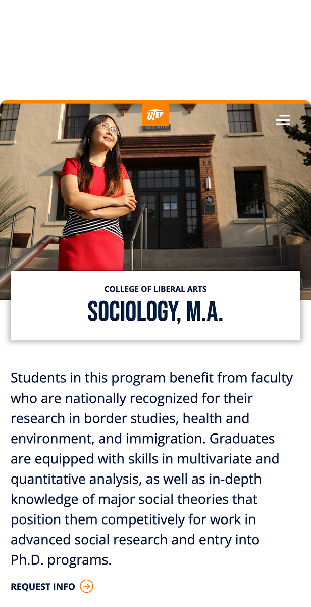
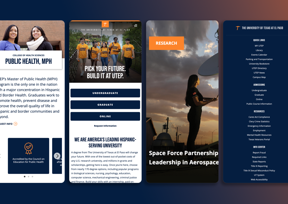
Undergraduate Index Page - Desktop
Program Page - Desktop
Components for Mobile
The Development
I built a CMS content type, which is an object containing a admin form for data entry and a corresponding database. The CMS then shares this content via an XML file, which is used to capture content in variables. These variables are inserted into an HTML template. When ready, content managers publish a static version of the pages to test or production.
Example of a profile card:
The Results
The new Academic Programs section launched alongside a redesigned homepage and delivered impressive results:
High Conversion Rate
MVP achieved a 4% conversion rate, exceeding initial goals
Digital Marketing
Integrated with CRM to capture leads and track performance
Scalable Solution
189 program pages were built by 20+ project managers
Easy to Maintain
New programs can be populated in just 3 minutes
No-Code Solution
Content managers can update programs without technical help
Modular Design
Sections can be omitted, reordered, or repeated
Multiple Options
Sections can be displayed in different styles
Thoroughly Tested
Secure, responsive, accessible, tested layouts
SEO Optimized
Built-in metadata for social media sharing and SEO
Case Studies
UTEP Academic Programs: Transforming University Program Discovery
Built UTEP's academic program discovery experience to help prospective students make informed career decisions. Through user research and no-code development, created flexible templates that achieved a 4% conversion rate while empowering content managers with no-code publishing workflows.
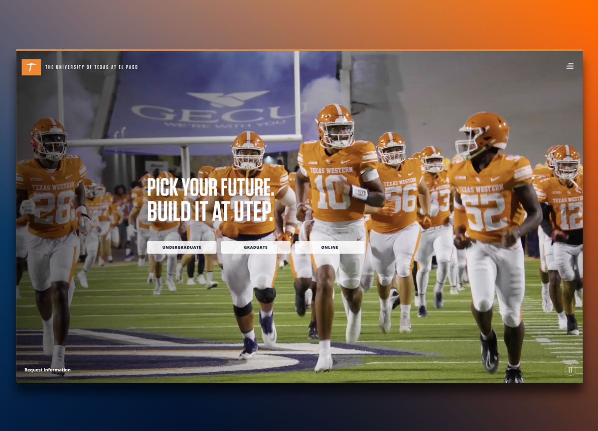
90% Above the Fold: How Data-Driven Redesign Transformed UTEP's Homepage
When UTEP's homepage analytics revealed that 90% of users never scrolled below the fold, we stripped away non-essential content and put academic program navigation front and center. The streamlined experience launched in one month, dramatically improving user engagement and successfully directing visitors to the programs they were seeking.
Enterprise CMS Implementation & Migration
Implemented a new CMS, managing a comprehensive project that included branding, UI design, and development of a pattern library and templates. I streamlined collaboration across engineering, QA, marketing, and editorial teams while leading a stakeholder group of 10 colleges and 11 divisions to gather requirements and negotiate product adoption. I audited 2,400 sites, migrating 400, and deleting 2,000 unused, while also training over 800 content managers. New CMS pages reach from 1.5-3 million per month.