The University of Texas at El Paso

Homepage & Academic Programs

Project Overview:
The objective was to redesign the University homepage and to create a new “academic programs” section. Our primary audience were prospective students. The ultimate goal of this project was to connect with prospective students through one of these interactions: form submission, request more financial or program information, and start the application process.
My Roles:
UX Research, UX design, UI Design, Front-end Developer, Project Manager.

Project Duration:
Jan 2021 – Jan 2022

The Problem

The University was missing the opportunity to connect with many prospective students that visited the homepage. The previous design had too much information for too many audiences, burying down the information for our primary audience, prospective students.
When prospective students were looking for academic programs information, the available tools were difficult to use. These tools offered a lot of academic information relevant to enrolled students and administrative staff, while prospective students were looking for simple, concise overview of the program that highlighted the its advantages.

The Goal

To create a web experience in which prospective students can get a quick overview of the academic programs’ advantages, career opportunities, and success stories, so they can take their first step towards their higher education.

Research

Quantitative Analysis

We analyzed heatmaps and scrollmaps, showing data of more than 50,000 users. We also observed hours of users interacting with the homepage.
A big part of the traffic was internal. This internal traffic used the homepage as a portal to launch internal applications. The majority of the users didn’t scroll below the fold. The few that scrolled, ignored most of the elements. Some elements were not clicked even once.
The research showed that the academic programs link, the most valuable element in the page, was not very popular.
Desktop Heatmap
mobile heatmap

Qualitative Analysis

Performed qualitative research by interviewing via Microsoft Teams 5 college students that recently went through the enrollment process. I also interviewed 4 SMEs with expertise in different aspects of the enrollment process. After the interviews, our assumptions were confirmed, there was an overload of information, but no clear information for prospective students.
Interviews Via Microsoft Teams

Pain Points

01.

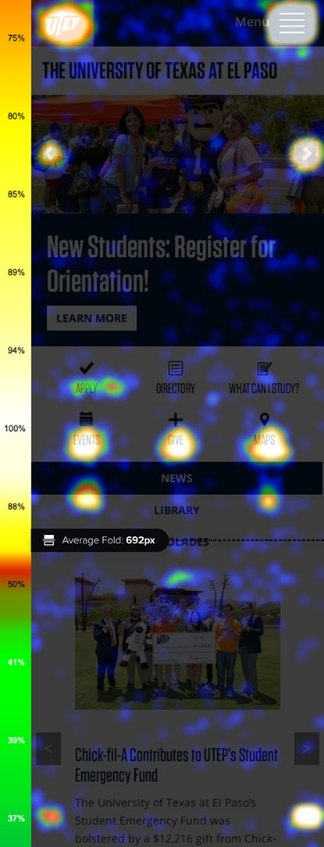
The homepage was not very useful for students looking for academic programs information; most of the content was irrelevant to prospective students.

02.

Users preferred to use search engines to find academic programs information instead of searching/browsing within the University website. External search results would vary greatly and this was confusing for the users.

03.

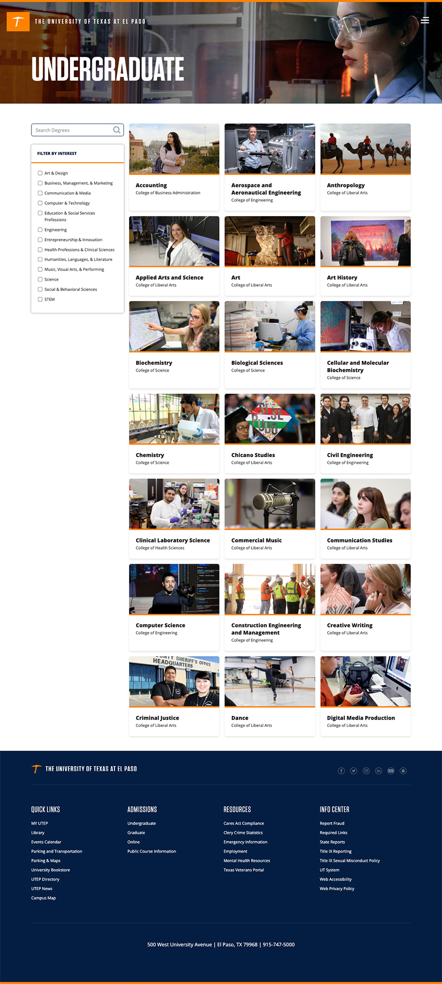
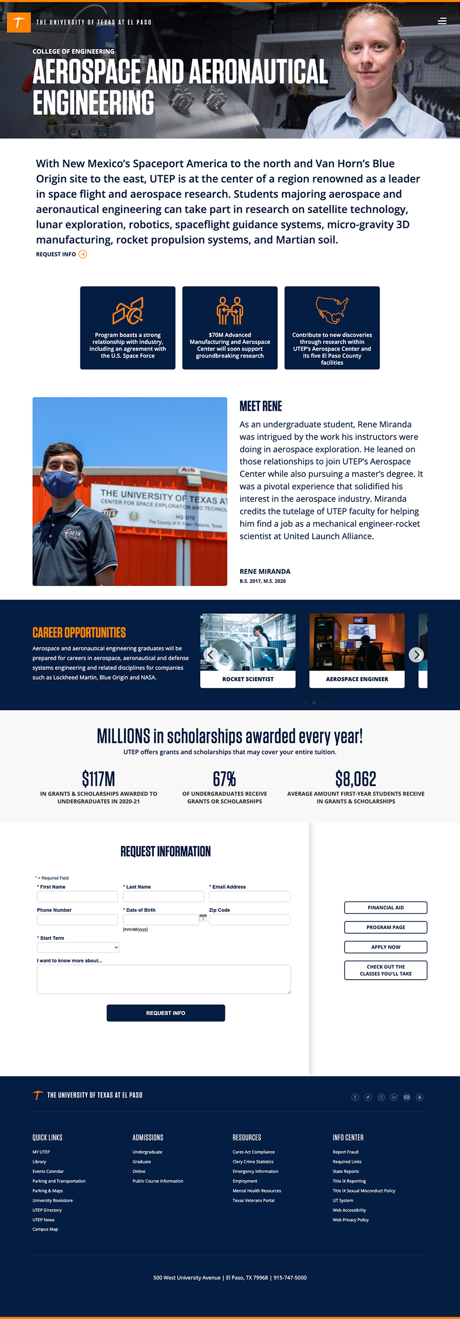
Prospective students couldn’t find a structured path to browse academic programs, visit, apply, or request more information.

04.

Prospective students were able to use the Academic Catalog to learn about the academic programs. However, the content of this tool includes policies, procedures, degrees, and lists of classes, which is useful information for enrolled students and administrative staff, but not very much for prospective students.

Personas

Angie
unsplash.com/photos/wRdYnqXtyYk
19 years old
High school student from Ciudad Juarez Chihuahua
Angie is a bilingual student who needs to connect with an academic advisor because she wants to learn more about a specific program.
“I wish the application process was easy and straightforward. I’m glad my high school advisor helped me and many other seniors.”
Frustrations
I had to rely on my high school advisor; he helped me a lot.
Struggled when visited the campus, a map would be helpful.
Goals
I have decided on the major I want to pursue. I need to find information specifically about the marketing department.
Israel
unsplash.com/photos/6CH6tftqENQ
18 years old
High school student from El Paso Texas
Israel is an El Pasoan high school student who needs to browse career opportunities because he is interested in a career that pays well.
“Using Google was more effective than using the University website. I had to Google the major name like “psychology major at UTEP”. Some of the results I got were accurate; others were hard to find.”
Frustrations
I was not able to find a consolidated list of majors.
I had to use Google to find some majors, but the information I found was not clear.
Goals
I want to be able to browse all the programs so I can compare them and decide which one is the best for me. Need to know what are the next steps to enroll.

Paper wireframes

Low Fidelity Wireframes

Wireframes V1: Homepage
Wireframes V1: Side Menu
Wireframes V1: User Stories

High Fidelity Wireframes

Wireframes V3: Homepage
Wireframes V3: Sidebar Menu
Wireframes V3: Mobile View
Wireframes V3: Menu

Refining the Design

Homepage Before
Homepage After
Navigation Before
Navigation After
Homepage Mobile Before
Homepage Mobile After
Single Program Page Before
Single Program Page After

Visual Design: Desktop

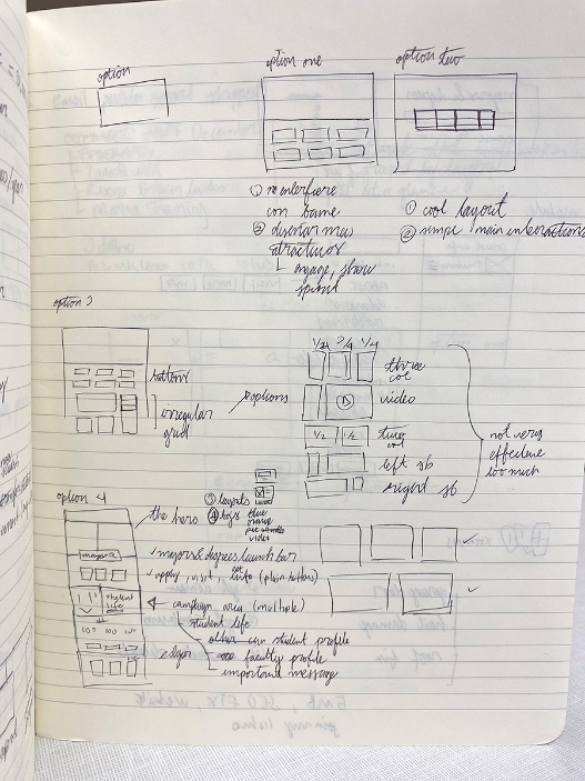
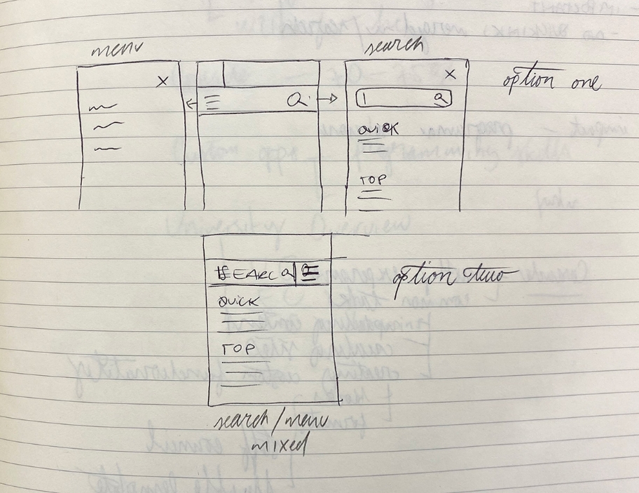
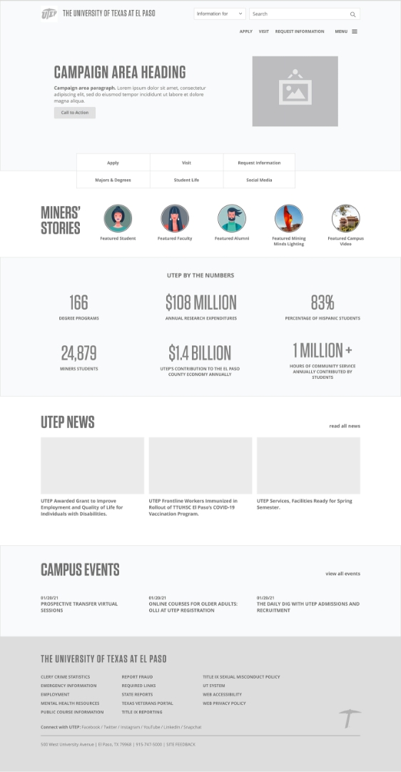
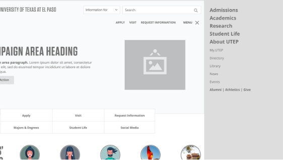
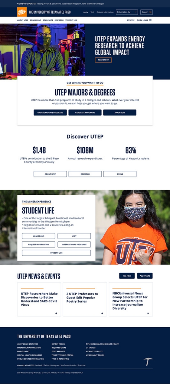
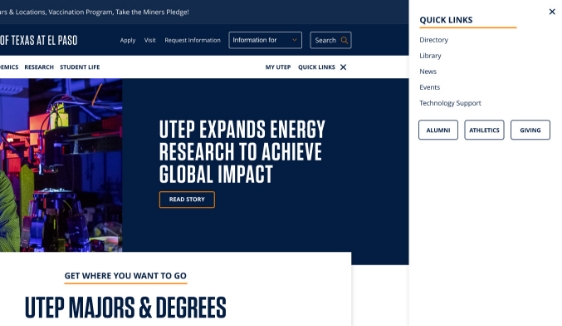
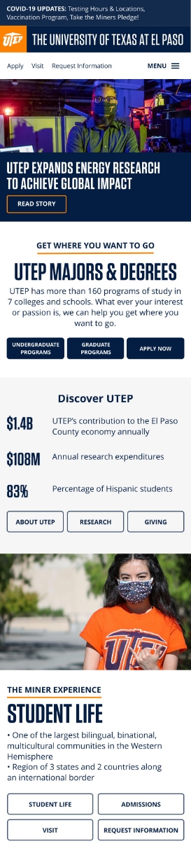
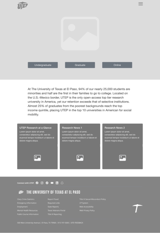
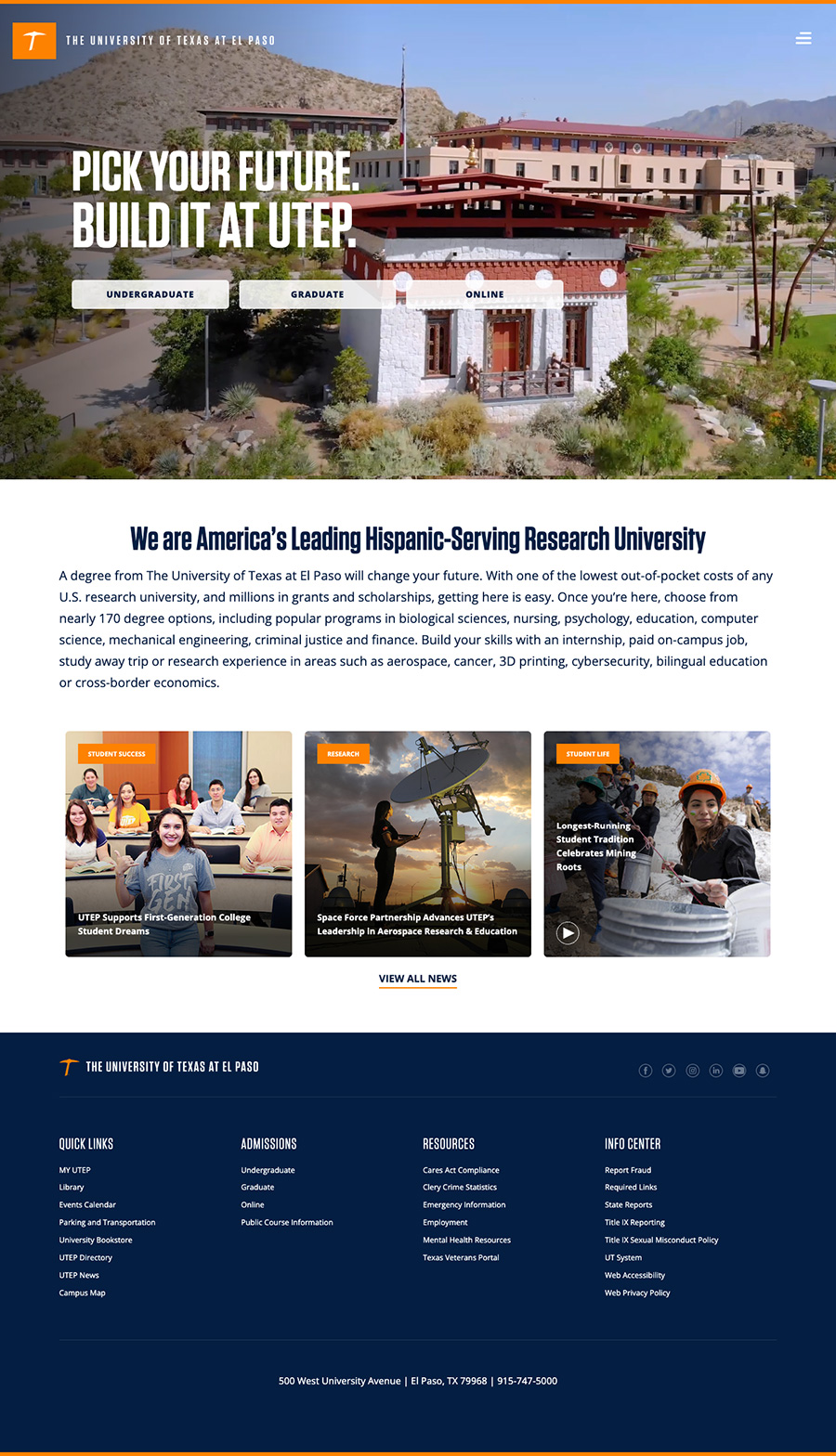
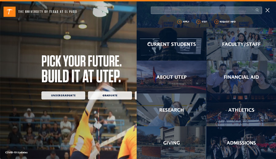
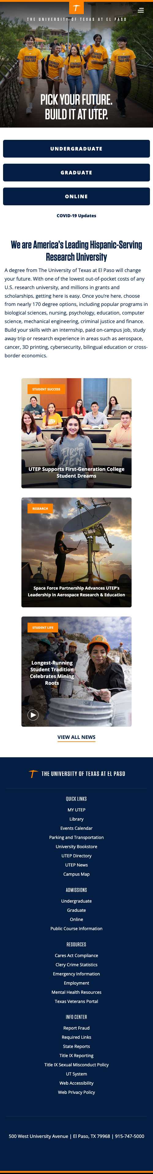
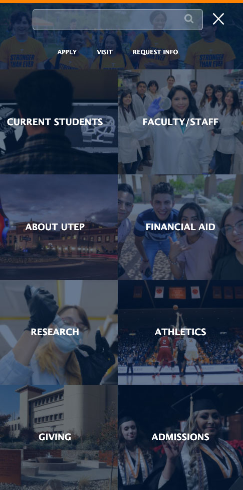
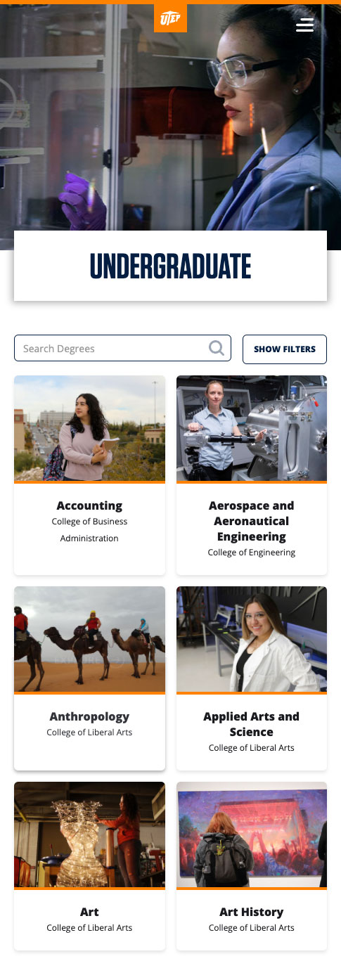
At this point the wireframes were delivered to one of the designers and he took care of the visual design. These were the results of the collaboration:

Homepage
Navigation
Programs Listing Page
Program Page

Visual Design: Mobile

Homepage
Navigation
Programs Listing Page
Program Page